![]()
![]()
aramappings computes dimensionality reduction mappings associated with Adaptable Radial Axes (ARA) plots (Rubio-Sánchez, Sanchez, and Lehmann 2017).
ARA is a type of “radial axes” multivariate visualization technique. Other prominent examples include star coordinates (SC) (Kandogan 2000, 2001) and biplots (Gabriel 1971; Gower and Hand 1995; Hofmann 2004; Grange, Roux, and Gardner-Lubbe 2009; Greenacre 2010), which have been used mainly for exploratory purposes, including cluster analysis, outlier and trend detection, decision support tasks. Their main appeal is the possibility to simultaneously display information about both data observations and variables. In particular, high-dimensional numerical data observations are represented as points (or other visual markers) on a two- or three-dimensional space, while data variables are represented through axis vectors, and optionally labeled line axes, similar to those in a Cartesian coordinate system.
With ARA, users create desired visualizations by selecting specific sets of axis vectors interactively (as in SC), where each vector is associated with a data variable. These axis vectors indicate the directions in which the values of their associated variables generally increase within the plot. Additionally, the high-dimensional observations are mapped onto the plot (in an optimal sense) in order to allow users to estimate variable values by visually projecting these points onto the labeled axes, as in Biplots.
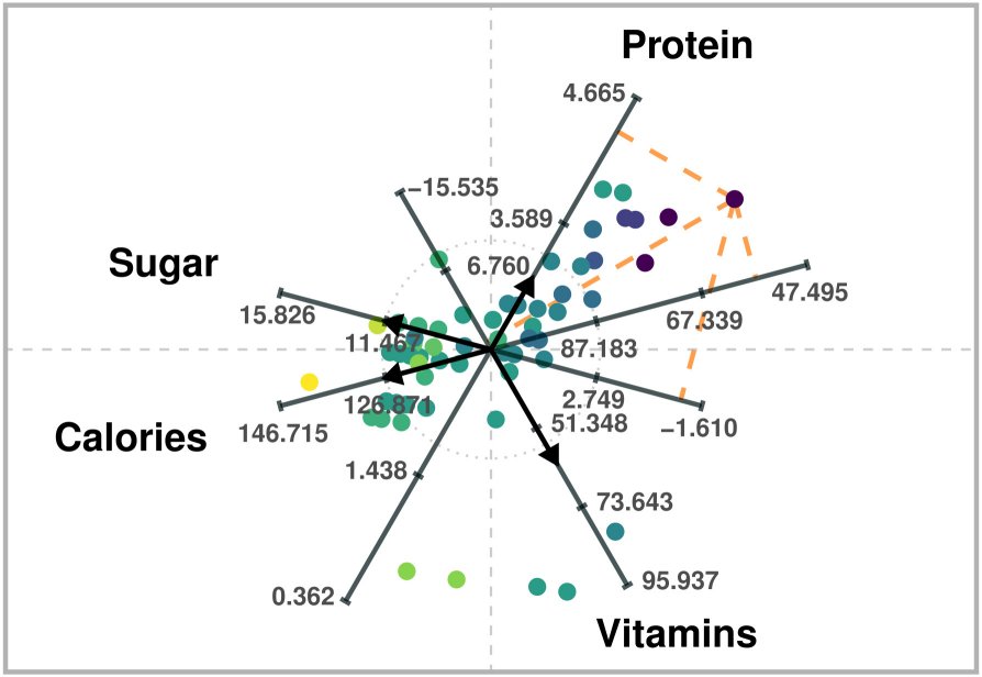
ARA plot of four variables of a breakfast cereal dataset. High-dimensional data values can be estimated via projections onto the labeled axes, as in Biplots.
The previous figure is an ARA plot of a breakfast cereal dataset. The axis vectors associated with the variables are chosen to distinguish between healthier cereals (toward the right) and less healthy ones (toward the left). For instance, points on the right will generally have larger values of Protein and Vitamins, and lower values of Sugar and Calories. Users can obtain approximations of data values by visually projecting the plotted points onto the labeled axes. For example, users would estimate a value of about 57 calories for the point that lies further to the right.
There are nine types of ARA plots (see the vignette). Thus, aramappings provides nine functions to generate each ARA mapping:
ara_unconstrained_l2()ara_unconstrained_l1()ara_unconstrained_linf()ara_exact_l2()ara_exact_l1()ara_exact_linf()ara_ordered_l2()ara_ordered_l1()ara_ordered_linf()Each function solves a convex optimization problem to map high-dimensional data observations onto two- or three-dimensional points that can be visualized in a plot. Each function is included in a separate source file, and calls (optimization) solver-specific functions. These functions rely on auxiliary methods included in file utils.R.
The main goal of the package is to provide functionality for generating the mappings, but not to create visualizations. Nevertheless, it includes a method for generating a two-dimensional plot for standardized data:
draw_ara_plot_2d_standardized()Install a stable version from CRAN
install.packages("aramappings")Install the development version of aramappings from GitHub with:
# install.packages("devtools")
devtools::install_github("manuelrubio/aramappings", build_vignettes = TRUE)
or
# install.packages("pak")
pak::pak("manuelrubio/aramappings")We recommend starting an exploratory analysis using an unconstrained ARA plot with the \(\ell^{2}\) norm, which can be generated very efficiently since the mappings can be obtained through a closed-form expression (i.e., a formula). The obvious first step is to load the aramappings package:
# Load package
library(aramappings)
In the usage examples we will use the Auto MPG
dataset available Kaggle, or the UCI Machine Learning Repository (Frank
and Asuncion 2010). We select a subset of numerical variables from the
dataset. The selected variables are specified through a vector
containing their column indices in the original dataset. Furthermore, we
rename the data set to X, simply for clarity with respect
to the notation defined above.
# Define subset of (numerical) variables
selected_variables <- c(1, 4, 5, 6) # 1:"mpg", 4:"horsepower", 5:"weight", 6:"acceleration")
n <- length(selected_variables)

# Retain only selected variables and rename dataset as X
X <- auto_mpg[, selected_variables] # Select a subset of variables
The ARA functions halt if the data or other parameters contain missing values. Thus, we proceed eliminating any row (data observation) that contains missing values. Naturally, another approach consists of replacing missing values by some other substituted values (imputation).
# Remove rows with missing values from X
N <- nrow(X)
rows_to_delete <- NULL
for (i in 1:N) {
  if (sum(is.na(X[i, ])) > 0) {
    rows_to_delete <- c(rows_to_delete, -i)
  }
}
X <- X[rows_to_delete, ]
At this moment X is a data.frame. In order to
use the ARA functions we first need to convert it to a matrix:
# Convert X to matrix
X <- apply(as.matrix.noquote(X), 2, as.numeric)
In addition, we strongly recommend standardizing the data when using
ARA. We save the result in variable Z since the function
that draws the plot needs the original values in X.
# Standardize data
Z <- scale(X)
Having preprocessed the data, the next step consists of defining the axis vectors, which are the rows of \(\mathbf{V}\). These can be obtained manually (ideally through a graphical user interface), or through an automatic method. For instante, \(\mathbf{V}\) could be the matrix defining the Principal Component Analysis transfomation (in that case the ARA plot would be a Principal Component Biplot). In this example, we simply define a configuration of vectors in polar coordinates and transform them to Cartesian coordinates.
# Define axis vectors (2-dimensional in this example)
r <- c(0.8, 1, 1.2, 1)
theta <- c(225, 100, 315, 80) * 2 * pi / 360
V <- pracma::zeros(n, 2)
for (i in 1:n) {
  V[i,1] <- r[i] * cos(theta[i])
  V[i,2] <- r[i] * sin(theta[i])
}
It is also possible to define weights in order to control the relative importance of estimating accurately on each axis. This is nevertheless complex, since the accuracy also depends on the length of the axis vectors. In this case, we have set two weigths to 1 and another two to 0.75. Visually, the weights determine the level of gray used to color the axis vectors in the ARA plot.
# Define weights
weights <- c(1, 0.75, 0.75, 1)
Having defined the data (Z), axis vectors
(V), and weights (weights), we can proceed to
compute the ARA mapping. For unconstrained ARA plots with the \(\ell^{2}\) norm the solver
parameter should be set to “formula” (the default), in order to obtain
the mapping through a closed-form expression. The following code
computes the embedded points and saves them in mapping$P,
and shows the execution runtime involved in computing the mapping.
# Compute the mapping and print the execution time
start <- Sys.time()
mapping <- ara_unconstrained_l2(
  Z,
  V,
  weights = weights,
  solver = "formula"
)
end <- Sys.time()
message(c('Execution time: ',end - start, ' seconds'))
#> Execution time: 0.00391793251037598 seconds
ARA plots can get cluttered when showing all of the axis lines and
corresponding labels at the tick marks. Thus, the function that we will
use to draw the ARA plot (draw_ara_plot_2d_standardized())
contains a parameter called axis_lines for specifying the
subset of axis lines (and labels) we wish to visualize. In this example
we will show the axes associated with variables “mpg” and
“acceleration”. Note that in the original data frame these were
variables 1 and 6. However, since we only retained four variables
(“mpg”, “horsepower”, “weight”, and “acceleration”), the column index of
“acceleration” is now 4.
# Select variables with labeled axis lines on ARA plot
axis_lines <- c(1, 4) # 1:"mpg", 4:"acceleration")
Also, the plotted points can be colored according to the values of a particular variable. In this example, we will color the points according to the value of variable “mpg”.
# Select variable used for coloring embedded points
color_variable <- 1 # "mpg"
Finally, we generate the ARA plot by calling
draw_ara_plot_2d_standardized():
# Draw the ARA plot
draw_ara_plot_2d_standardized(
  Z,
  X,
  V,
  mapping$P,
  weights = weights,
  axis_lines = axis_lines,
  color_variable = color_variable
)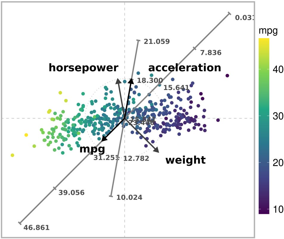
Unconstrained ARA plot with the l2 norm of a subset of the Autompg dataset.