henna is a suite comprising several visualization
utilities. They are designed with scRNA-seq data analysis in mind but
are well-suited to a variety of other applications as well.
To install the version of henna currently available on
CRAN, run the following R code:
install.packages("henna")Alternatively, you can install the most recent development version using this code:
devtools::install_github("andrei-stoica26/henna")Currently, both versions are the same (0.7.5).
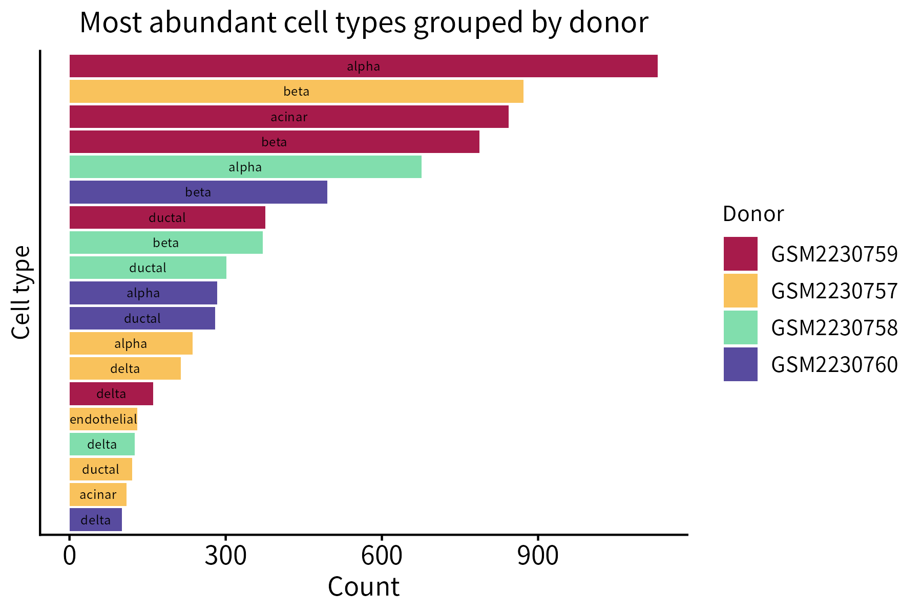
The data used to generate the figures presented here comes from the human Baron pancreas (HBP) dataset, which can be accessed through the scRNAseq package. The code used to generate the figures is provided in the scripts folder.
This function creates a bar plot that quantifies the items belonging to different classes. Its required input is a data frame whose first two columns are categorical (classes and items) and third column is numeric (counts).
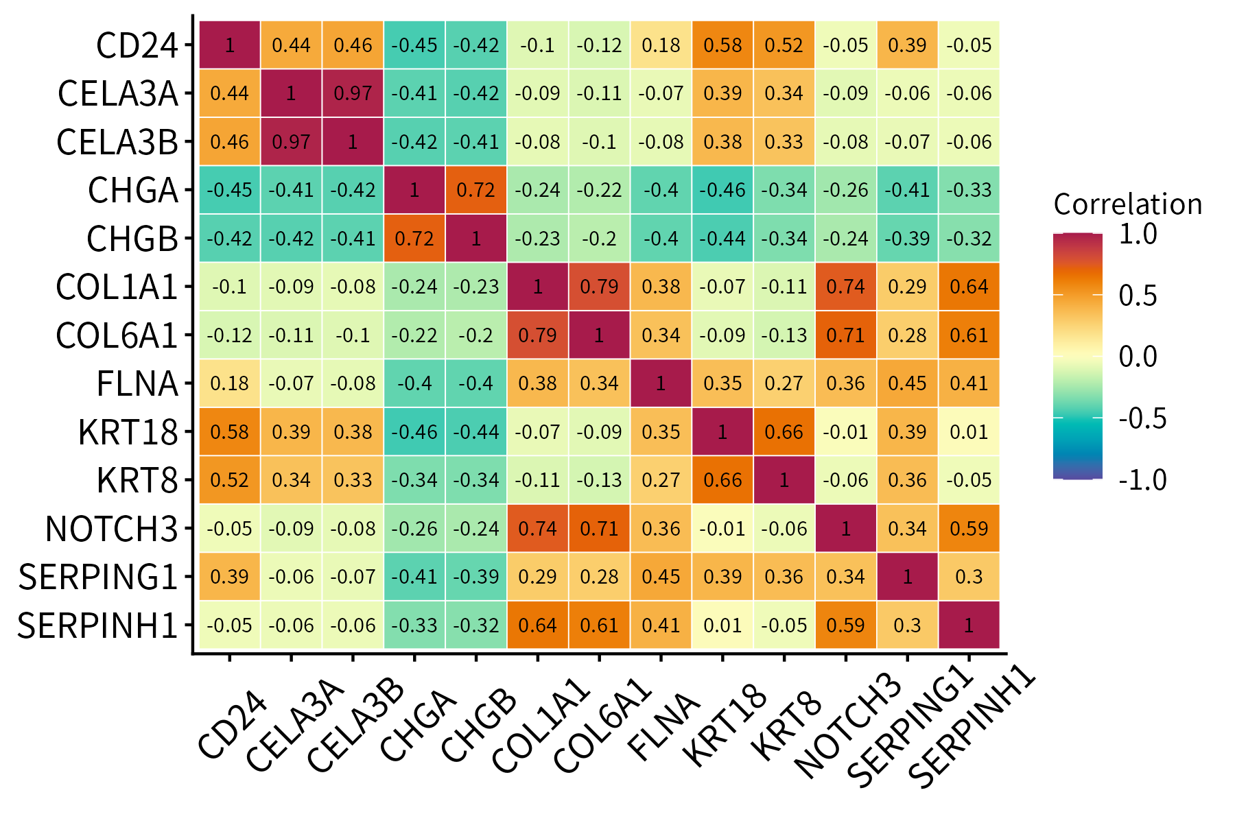
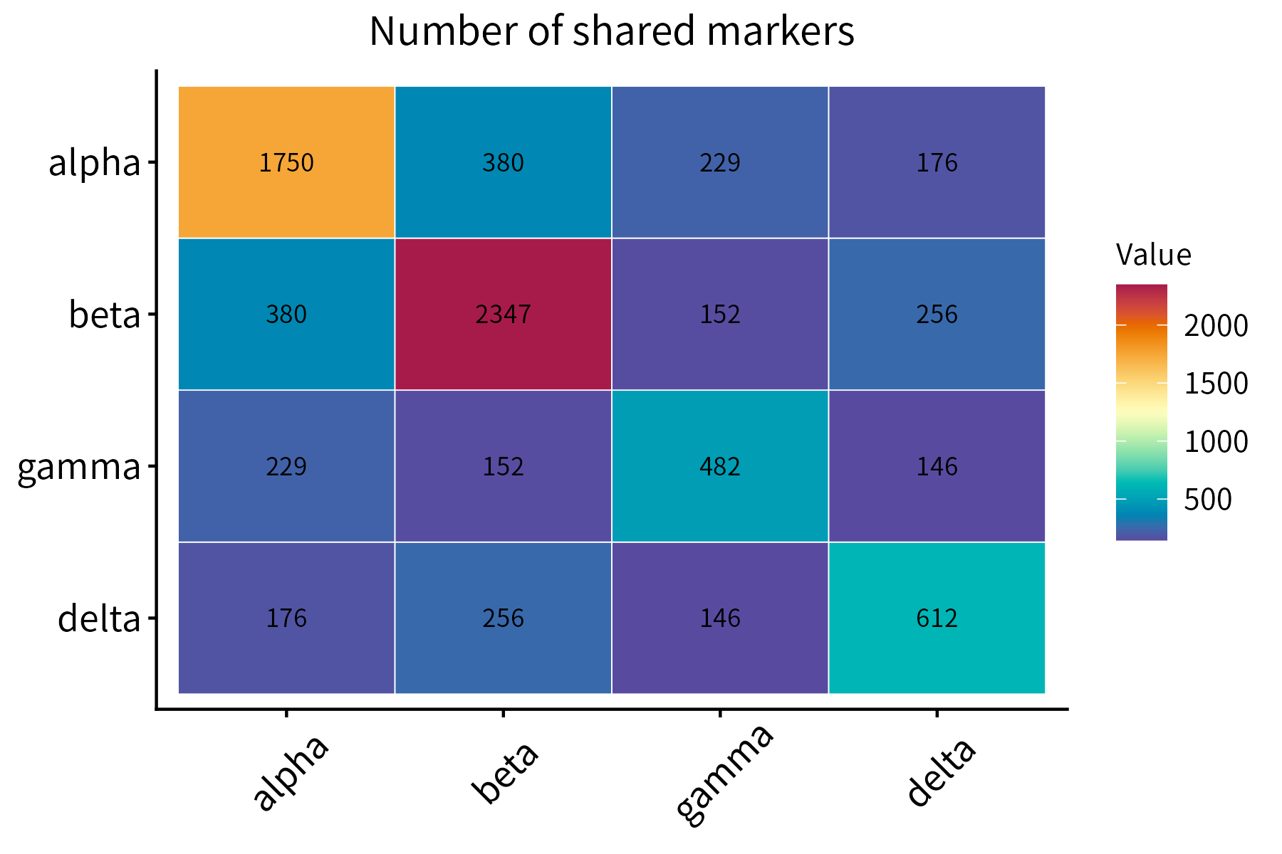
This function plots a correlation matrix. It accepts a matrix or data frame as input.
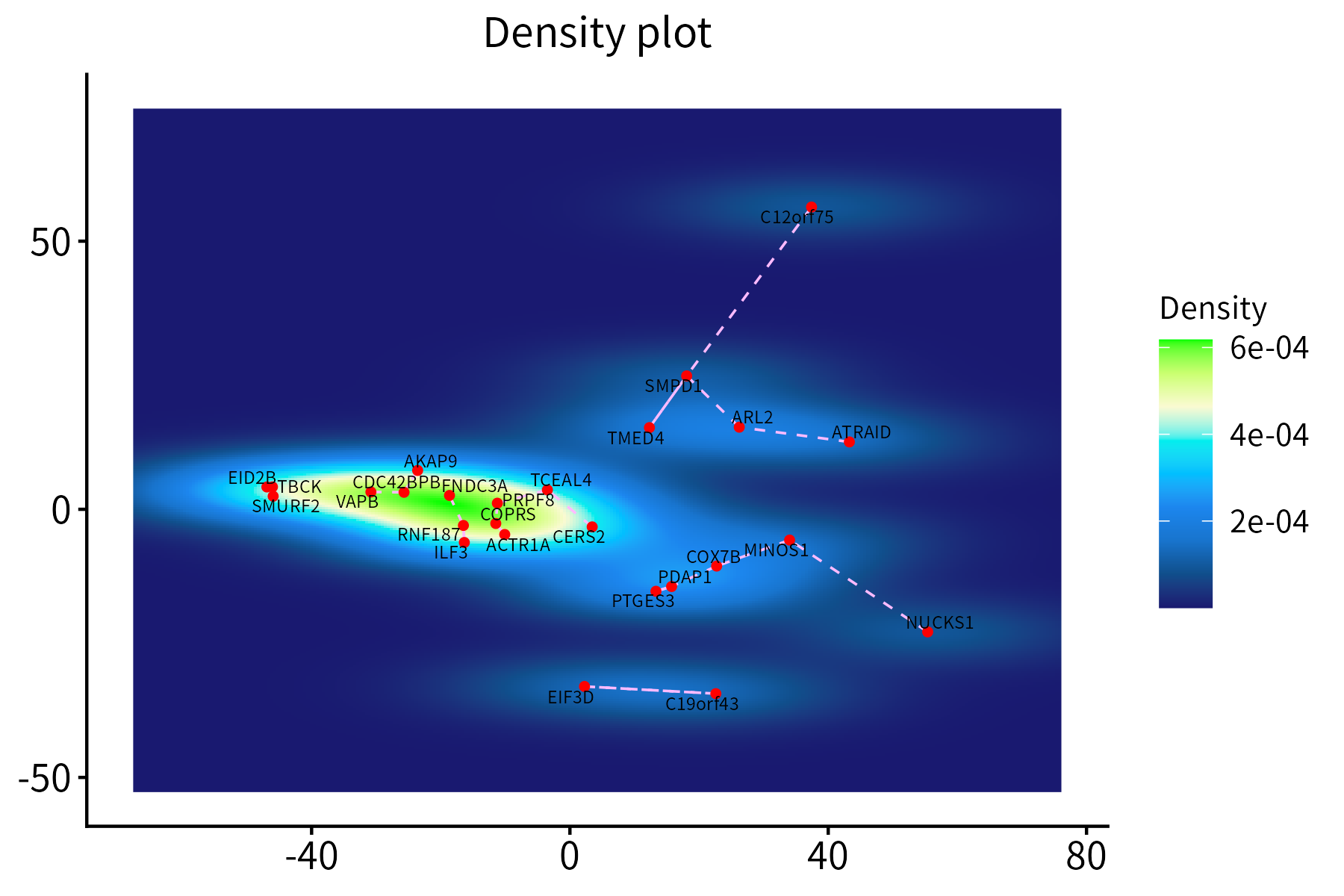
This function creates a density plot for a set of points, optionally
displaying segements between each point and its nearest neighbor. It
requires a data frame with the x and y
coordinates of the points, which may additionally contain score and
nearest-neighbor columns.
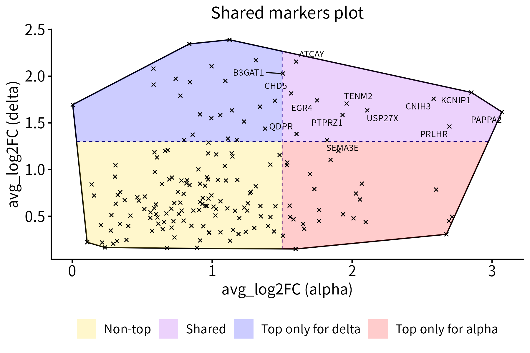
This function plots a set of points together with their convex hull.
Optionally, it divides the points into 2 or 4 classes of different
colors by drawing a vertical and/or a horizontal line that intersects
the hull. It can also label selected points. The required input is a
data frame with x and y coordinates.
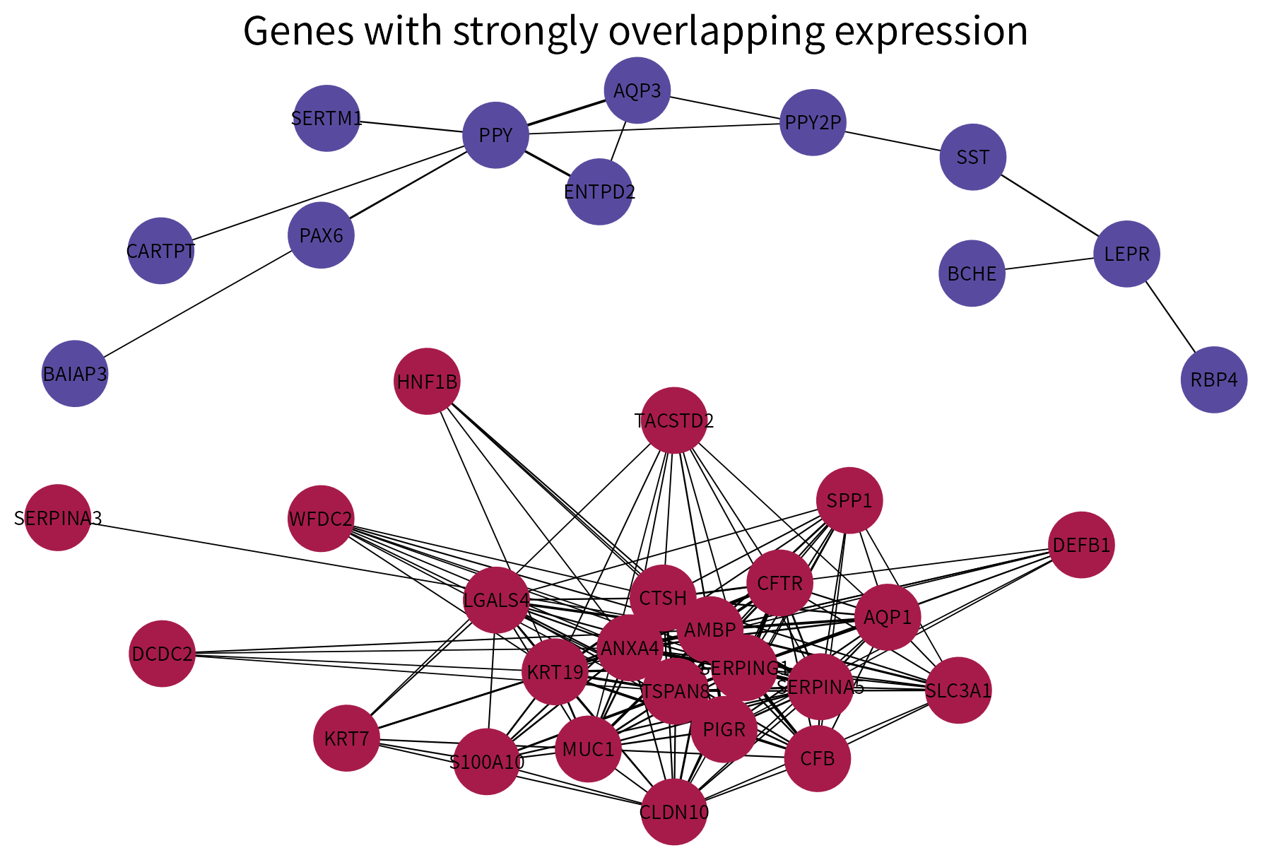
This function plots a graph using different colors for nodes that are part of different connected components. It requires as input a data frame whose first two columns are categorical and represent the vertices of the edges in a graph. A numeric column representing either edge weights or edge ranks (these will be converted into weights) can also be provided. If available, this column will be used to vary edge width.
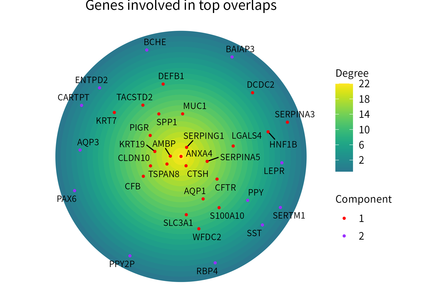
This function plots positive numeric-valued points over concentric circles, with points located more centrally representing higher values. Optionally, the points can be assigned to groups and colored on the basis of thes groups.
The input data frame must store the point labels in its first column and their numeric values in its second column. A third column (categorical) representing the group where each point is assigned can also be provided.
This function aggregates multiple ranks available for a group of items in a single plot. Average ranks can be displayed on the plot.
![]()
This function generates an alluvial plot for a data frame with two categorical columns and a numeric column.
In the example below, it represents the significance of pairs of overlaps between the markers of groups belonging to two identity classes (cell type and donor).
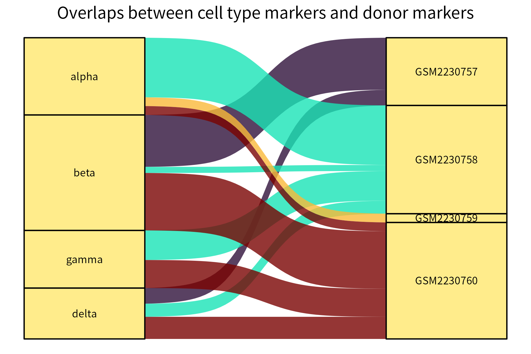
Stronger overlaps correspond to thicker connecting curves.
This function plots a numeric matrix. It is a more general version of
correlationPlot.
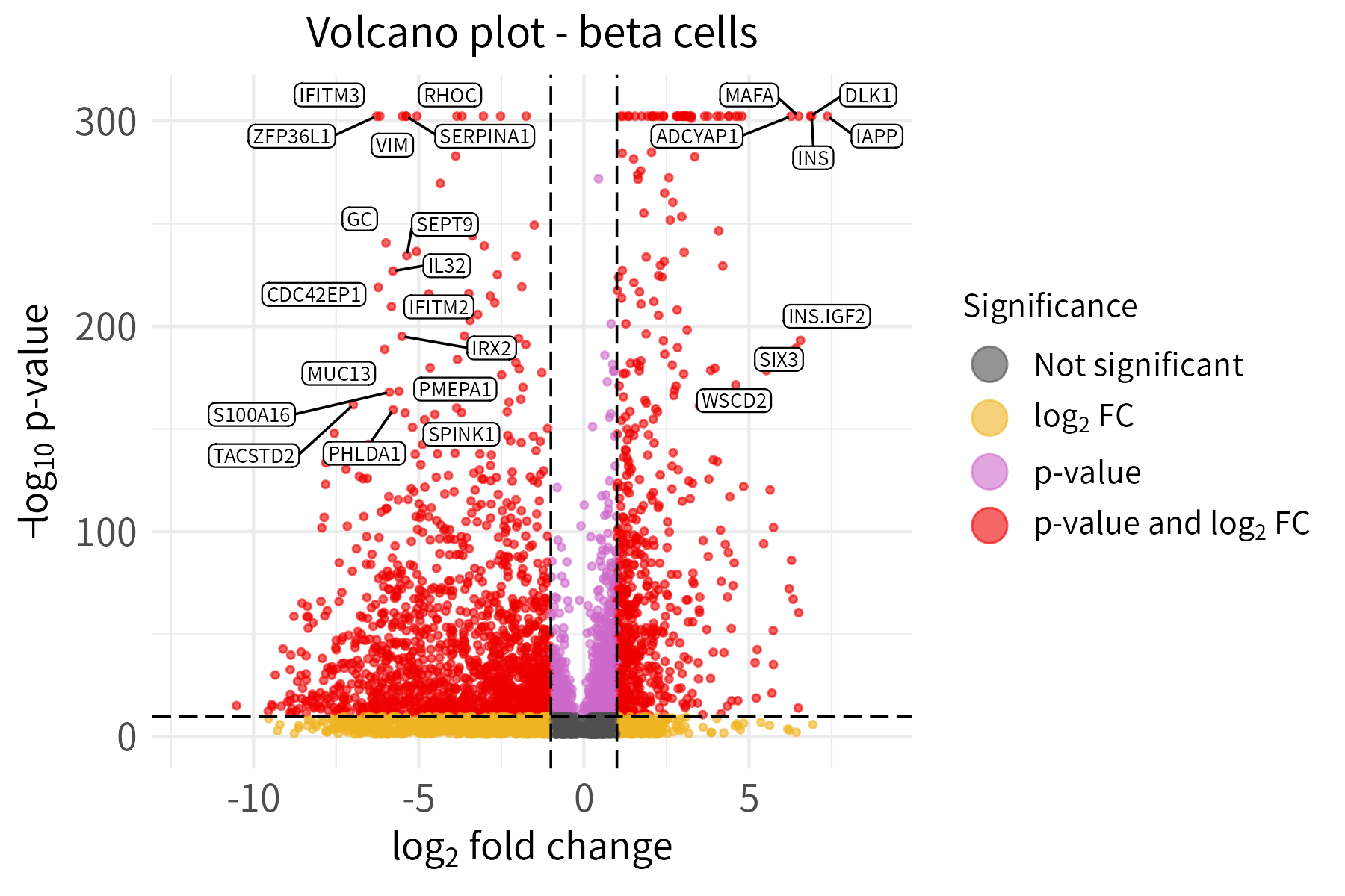
If the Bioconductor dependency EnhancedVolcano
(not installed automatically with henna) is available, this
function can be used to create a volcano plot for a data frame with a
log column and a p-value column. The gene names must be provided as row
names.
Users can input labeled genes in two ways:
The default option is preferred in the example below. To emphasize the usage of different thresholds for labeling and significance, the thresholds for labeling are set much higher than the thresholds for significance.